AI Logo Workflow: Brief to a Scalable Logo System
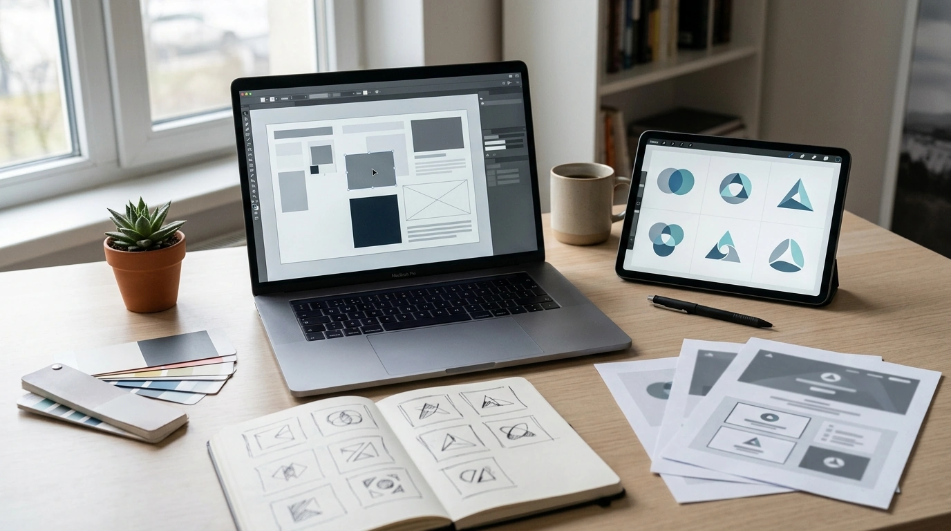
Logo Magic with AI: From Brand Brief to a Clean, Usable Logo System
A strong logo is less about luck and more about process: clear brand inputs, fast exploration, and disciplined refinement. A practical workflow uses ChatGPT to turn messy ideas into crisp brand direction, then Midjourney to explore visuals quickly—followed by a professional “make it real” phase where the best concept becomes files that work on websites, social profiles, packaging, and print.
Start with a brand brief that can’t be misunderstood
Before you generate anything, lock down inputs that are specific enough to guide design decisions. A brief that’s vague (“modern and clean”) usually produces logos that look generic, because the guardrails are missing.
- Define the business in one sentence: what it does, who it serves, and what makes it different.
- List 3–5 brand traits (e.g., minimal, bold, friendly, premium) and what each trait should look like visually.
- Choose a logo type direction to test first: wordmark, monogram, symbol + wordmark, or emblem.
- Collect visual guardrails: colors to avoid, symbols to avoid, and any industry clichés to skip.
- Decide success criteria early: legible at small sizes, recognizable in one color, scalable, and adaptable to light/dark backgrounds.
Turn brand inputs into clear creative directions with ChatGPT
Great exploration is structured exploration. Instead of generating random styles, translate the brief into a handful of “routes” that each have a distinct logic—so you can compare options without losing coherence.
- Generate 2–4 distinct creative routes (e.g., geometric minimalism, organic craft, tech-forward, heritage) based on the brief.
- Create a short naming and tagline exploration if needed, then pick one direction before making visuals.
- Build a “do/don’t” list for typography, icon style, spacing, and complexity so visual exploration stays consistent.
- Ask for a compact brand voice snapshot (tone, vocabulary, and values) to keep the logo aligned with messaging.
- Prepare a checklist for feedback: legibility, memorability, uniqueness, and brand fit—so revisions stay objective.
Brand brief to design outputs
| Brand input | AI-assisted output | What to decide before moving on |
|---|---|---|
| Audience + problem | Positioning statement + key benefits | One primary target customer profile |
| Brand traits | Style routes and visual descriptors | Top 1–2 routes to pursue |
| Competitors | Differentiation notes + avoid list | Clichés and overused symbols to avoid |
| Use cases | File and layout requirements | Where the logo must work at tiny sizes |
| Constraints | Design guardrails | Non-negotiables (colors, icons, vibe) |
Explore logo concepts in Midjourney without losing control
Fast iteration is only useful when it stays aligned to a plan. The goal is to find a simple, ownable form—not a highly-rendered illustration that can’t be reproduced cleanly.
- Create a consistent structure for your text inputs: brand style, logo type, icon concept, composition, and background requirements.
- Run small batches of variations and label winners by route (Route A/B/C) instead of saving random favorites.
- Steer away from overly detailed marks; aim for simple shapes that could be rebuilt as vector artwork.
- Request clean backgrounds and high contrast so the silhouette can be evaluated quickly.
- Repeat the same concept across different styles (minimal, line-art, geometric) to discover the most ownable form.
Select the best concept using practical tests
Choosing a logo is easier when you stop judging it as “art” and start testing it as a tool. The best concept usually wins multiple tests, not just one.
- Thumbnail test: reduce to favicon size; if it becomes noise, simplify.
- One-color test: the mark should work in black and white without gradients.
- Mirror test: flip horizontally; strong forms remain balanced and recognizable.
- Distance test: step back from the screen; the silhouette should still read.
- Uniqueness check: search visually for similar symbols in the industry to avoid confusion.
Refine into a real logo system (not just a single image)
A single exported image isn’t a logo system. A usable identity includes rules, variants, and lockups designed for real layouts and real constraints.
- Rebuild the chosen concept as clean vector shapes in a design tool so it scales without artifacts.
- Choose typography that matches the brand traits and has strong legibility across weights.
- Define spacing rules: clear space, minimum size, and alignment for icon + wordmark lockups.
- Create 3 core lockups: horizontal, stacked, and icon-only.
- Create color variants: full color, black, white, and one high-contrast alternative for tricky backgrounds.
Prepare deliverables clients and platforms actually need
Rights, originality, and responsible use
For additional background, review trademark overviews from USPTO and WIPO, plus professional practice guidance from AIGA.
A faster workflow for designers and a safer workflow for founders
What’s included in Logo Magic with AI
If you want the full workflow packaged as a repeatable system, Logo Magic with AI (digital download) covers the end-to-end path from brand definition to export-ready assets.
To keep the rest of your launch organized, pair it with The Smart Goal Setter’s AI Checklist and AI-Powered Productivity: The Smart To-Do List Checklist That Practically Organizes Itself.
FAQ
Can a logo made with AI be used commercially?
Commercial use depends on the tool’s terms and whether the final mark is sufficiently original. Treat AI outputs as concepts, rebuild the logo as clean vector artwork, and run similarity checks; if you plan to trademark, pursue appropriate clearance steps first.
What’s the quickest way to get a logo that looks professional?
Start with a tight brief, pick 1–2 clear style routes, and prioritize simple shapes that stay legible at small sizes. A professional result usually comes from building a full logo system (lockups, colorways, spacing rules) instead of relying on a single image.
Do designers still need vector software if AI creates the concept?
Yes—vector rebuilding is what makes curves clean, edges consistent, and scaling reliable across print and digital. AI can speed up exploration, but a design tool is still needed to finalize geometry, spacing, and the file formats vendors and platforms actually require.



Leave a comment